ColorColoris – un osservatorio di esperti cultori uniti nello studio e nello sviluppo del colore nelle sue varie applicazioni : moda – design – arredamento – arte – beauty – food
Capturing everyday beauty anywhere and
everywhere in time, places, people.
•
•
•
•
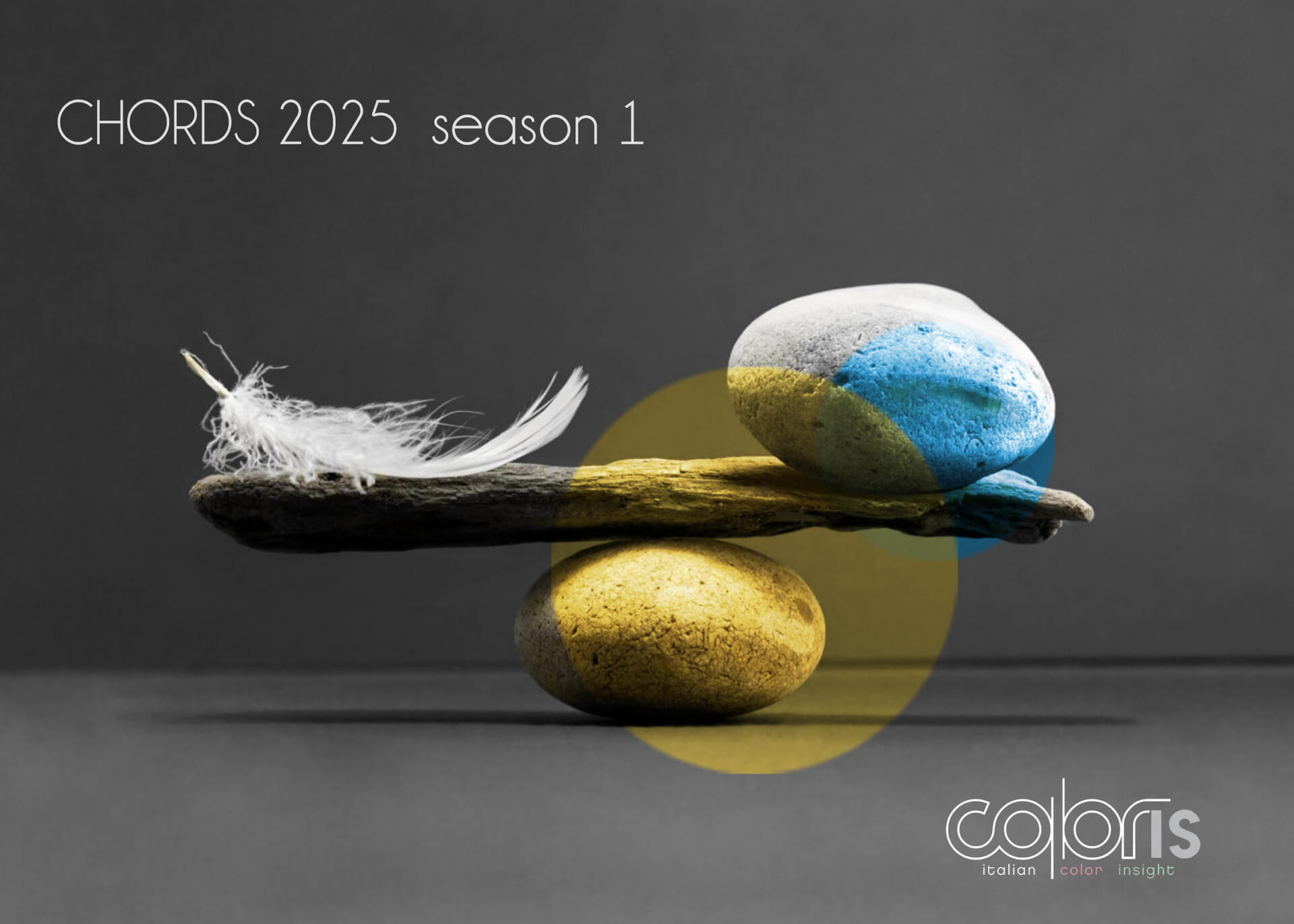
Anywhere everywhere is our first palette for spring
summer season 2025.
#colour #colourpalette #trends #fashiontrends
#colourtrends #trendsetter #anywhere #everywhere
Capturing everyday beauty anywhere and
everywhere in time, places, people.
•
•
•
•
Anywhere everywhere is our first palette for spring
summer season 2025.
#colour #colourpalette #trends #fashiontrends
#colourtrends #trendsetter #anywhere #everywhere
Capturing everyday beauty anywhere and
everywhere in time, places, people.
•
•
•
•
Anywhere everywhere is our first palette for spring
summer season 2025.
#colour #colourpalette #trends #fashiontrends
#colourtrends #trendsetter #anywhere #everywhere
Redescovering nature in the shades of a dawn is redescovering yourself. A new day, a new life.
Credits: @roamlegacy
•
•
•
•
•
•
#colorcoloris #shader #colourshades #anywhere #everywhere #trendsetter #fashion #design
Dry, essential yet sophisticate. Only going back to our roots we will be able to find our personal way to the future.
Credits: @shi7elo.sh
•
•
•
•
#future #roots #trends #colours #colorcoloris #colourtrends #anywhere #everywhere
Capturing everyday beauty anywhere and everywhere in time, places, people.
•
•
•
•
Anywhere everywhere is our first palette for spring summer season 2025.
#colour #colourpalette #trends #fashiontrends #colourtrends #trendsetter #anywhere #everywhere
Capturing everyday beauty anywhere and everywhere in time, places, people.
•
•
•
•
Anywhere everywhere is our first palette for spring summer season 2025.
#colour #colourpalette #trends #fashiontrends #colourtrends #trendsetter #anywhere #everywhere
Capturing everyday beauty anywhere and everywhere in time, places, people.
•
•
•
•
Anywhere everywhere is our first palette for spring summer season 2025.
#colour #colourpalette #trends #fashiontrends #colourtrends #trendsetter #anywhere #everywhere
Colore, immagine e comunicazione: una ricerca continua. Analisi dei colori in tendenza e proposte colore per il futuro. Visione analitica e intuitiva dei cambiamenti cromatici che determinano il successo di un prodotto. Il colore visto come strumento di identità e di stile.
Cosa facciamo
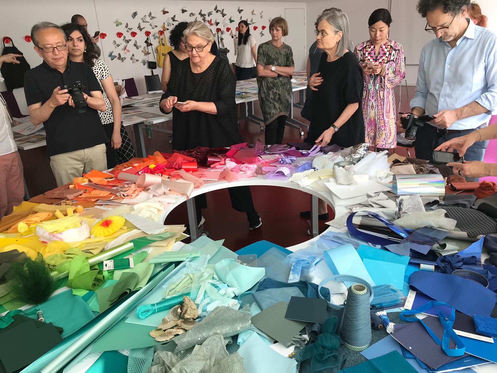
ColorColoris organizza incontri programmati durante i quali vengono analizzati gli eventi legati a moda, arte, cultura, scienza e società, visioni che determinano l’evoluzione globale del nostro tempo. ColorColoris prevede e crea gamme colore che caratterizzeranno le collezioni future, in tutte le categorie merceologiche in cui il colore è protagonista.
Analisi dei trend
I colori sono ovunque
visione condivisa
Impariamo insieme
progetti & riviste
siamo internazionali
COLOR FORECAST
Con 24 mesi di anticipo ColorColoris definisce le previsioni delle gamme cromatiche applicate dalle filiere del design, della moda e dello sport, dalla materia prima, al prodotto finito.
Utilizziamo i cookie sul nostro sito Web per offrirti l'esperienza più pertinente ricordando le tue preferenze e le visite ripetute. Cliccando su “Accetta tutto” acconsenti all'uso di TUTTI i cookie. Tuttavia, puoi visitare "Impostazioni cookie" per fornire un consenso mirato.
Questo sito utilizza i cookie per migliorare la tua esperienza durante la navigazione nel sito. Di questi, i cookie classificati come necessari vengono memorizzati nel browser in quanto sono essenziali per il funzionamento delle funzionalità di base del sito web. Utilizziamo anche cookie di terze parti che ci aiutano ad analizzare e capire come utilizzi questo sito web. Questi cookie verranno memorizzati nel tuo browser solo con il tuo consenso. Hai anche la possibilità di disattivare questi cookie. Tuttavia, la disattivazione di alcuni di questi cookie potrebbe influire sulla tua esperienza di navigazione.
I cookie funzionali aiutano a eseguire determinate funzionalità come condividere il contenuto del sito Web su piattaforme di social media, raccogliere feedback e altre funzionalità di terze parti.
I cookie per le prestazioni vengono utilizzati per comprendere e analizzare gli indici di prestazioni chiave del sito Web che aiutano a fornire una migliore esperienza utente per i visitatori.
I cookie analitici vengono utilizzati per capire come i visitatori interagiscono con il sito web. Questi cookie aiutano a fornire informazioni sulle metriche del numero di visitatori, frequenza di rimbalzo, fonte di traffico, ecc.
I cookie pubblicitari vengono utilizzati per fornire ai visitatori annunci e campagne di marketing pertinenti. Questi cookie tengono traccia dei visitatori sui siti Web e raccolgono informazioni per fornire annunci personalizzati.
I cookie necessari sono assolutamente essenziali per il corretto funzionamento del sito web. Questi cookie garantiscono le funzionalità di base e le caratteristiche di sicurezza del sito web, in modo anonimo.
Do you or one of your family members have a disability and need assistance and support in living independently and being included in the community?